Graphic Design
As part of my breadth studies at the University of Melbourne, I undertook Graphic Design Studio 1: Image & Text, a subject that challenged me to explore the intersection of typography, visuals, and meaning. Through a series of diverse and engaging assignments, I developed skills in creating compelling visual narratives. This subject was a rewarding journey that bridged technical skills and creative expression, reinforcing my passion for design and its ability to communicate complex ideas visually..
Record Cover
A highlight was a multimedia assignment in which I designed a record cover, merchandise, and promotional posters for the song Hell N Back by BAKAR. This project allowed me to experiment with branding and storytelling, translating the song's mood and themes into cohesive visuals. From bold imagery to dynamic layouts, I explored how design can amplify and complement music's emotional impact.


Visualising the Song
The record cover for "Hell N Back" is designed to reflect the themes and emotions conveyed in the song. It features a dark and moody aesthetic, with a focus on gritty textures and bold typography.
Another design strategy features abstract imagery, such as a swirling vortex or a fiery explosion. The imagery could is designed to convey the sense of being pulled into a chaotic and uncertain place, reflecting the feeling of going through difficult times.
Illustrations for the Song
Using the colour palette as a reference, I drew a few illustrations and played around with their colours, hues, tints, etc to see what goes well together.
The idea is for the front and back cover to have contrasting moods which reflects the songs upbeat music but sad, moody lyrics that talk about Bakar's fight with depression and loss of self worth.


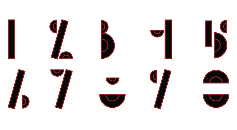
Typeface
Another key project involved designing a custom typeface, where I delved into the nuances of letterforms, spacing, and the rhythm of text to create a unique, cohesive alphabet. This process honed my attention to detail and deepened my understanding of typography as a visual language.